

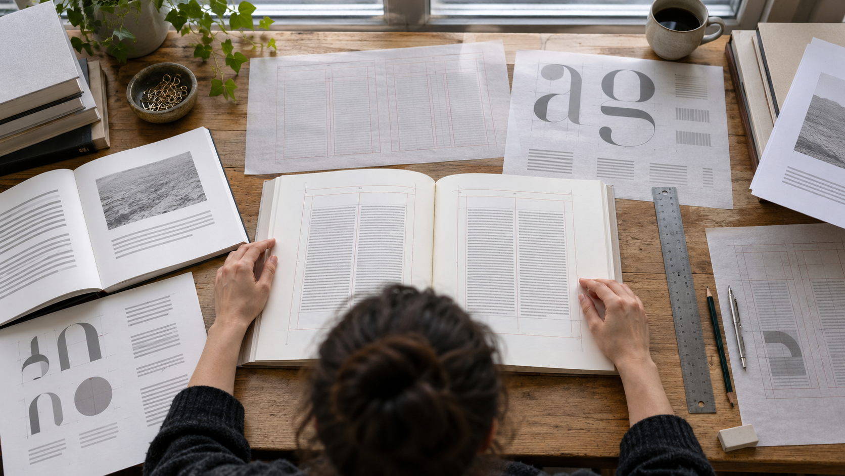
Book Typography Explainer
Book typography is the design of written language as a sustained reading experience. It includes typeface, size, line length, leading, margins, paragraph treatment, alignment, page numbers, headings, notes, captions, and the relationship between text and images. The goal is not to make every choice invisible. Typography can carry historical, emotional, or genre associations, but it must also help readers locate information and move through hundreds of pages without unnecessary friction.
Body text works as a system. A typeface that reads well at one size may feel cramped or weak at another. Long lines can make it hard for the eye to find the next line; short lines create frequent returns and uneven word spacing. Leading affects density and continuity, while margins create handling space and frame the text block. Designers test these variables together on the actual trim size rather than approving a font in isolation on a screen.
Hierarchy signals how parts relate. Title pages, chapter openings, section heads, running heads, extracts, footnotes, lists, and captions need distinct but compatible treatments. Contrast can come from scale, weight, style, position, spacing, or color. Too little contrast hides structure; too much turns every element into a competing voice. A coherent system lets readers predict what a form means without forcing every category to look dramatic.
Detailed composition addresses widows, orphans, hyphenation, rivers, loose lines, punctuation, small capitals, numerals, ligatures, and language-specific characters. Editors and designers must coordinate because wording changes affect page breaks and index locators. Accessibility may require stronger contrast, generous size, clear navigation, and careful ebook semantics. Print imposes paper, ink, binding, creep, and manufacturing tolerances, while reflowable digital books give readers more control over display. To evaluate book typography, read several pages rather than judging a cover or specimen. Notice whether your place remains clear, headings are consistent, notes are findable, and emphasis is distinguishable without noise. Then inspect how the system handles difficult pages such as dialogue, tables, poetry, images, or long notes. Good typography respects the text, reader, format, and production method at once. Its success appears in the ease and confidence of reading. A practical way to read or discuss Book Typography is to begin with the basic definition and then identify the choices made in a particular example. Book typography coordinates type, spacing, margins, hierarchy, navigation, and page structure across a sustained reading experience. Next, ask who sets the relevant rules, who performs the work, and which results follow from creative judgment, law, contracts, technology, budget, or production limits. Similar-looking examples can operate differently because their audience, market, format, timing, and agreements are different. Composition details include hyphenation, widows, orphans, loose lines, punctuation, numerals, ligatures, and character support. It also helps to distinguish a formal industry category from an informal critical label or one organization's current practice. That separation keeps a memorable anecdote from becoming a false universal rule. Dates and territories matter: tools, distribution systems, audience behavior, and standard agreements change, while older examples can preserve assumptions that no longer apply everywhere. When a claim sounds absolute, compare it with a second kind of source and look for the conditions under which the claim is true. Then trace the process from the visible result back through the less visible decisions, handoffs, and quality checks that produced it. Successful typography supports long reading, clear structure, and the text's voice without demanding constant attention to itself. Finally, compare the example with a contrasting case and note which part of the definition still holds. This method keeps the explanation grounded, highlights the people and systems behind the outcome, and leaves room for reasonable disagreement about hybrid or borderline cases.
Book typography coordinates type, spacing, margins, hierarchy, navigation, and page structure across a sustained reading experience.
Typeface, size, line length, and leading must be tested together on the intended trim and paper rather than separately.
Hierarchy uses scale, weight, style, position, and spacing to make chapters, sections, notes, and captions predictable.
Composition details include hyphenation, widows, orphans, loose lines, punctuation, numerals, ligatures, and character support.
Print introduces paper, ink, binding, and manufacturing limits; digital formats introduce reflow, device, and semantic requirements.
Successful typography supports long reading, clear structure, and the text's voice without demanding constant attention to itself.
Explore more "Explainers"
Discover additional explainers across politics, science, business, technology, and other fields. Each explainer breaks down a complex idea into clear, everyday language—helping you better understand how major concepts, systems, and debates shape the world around us.