

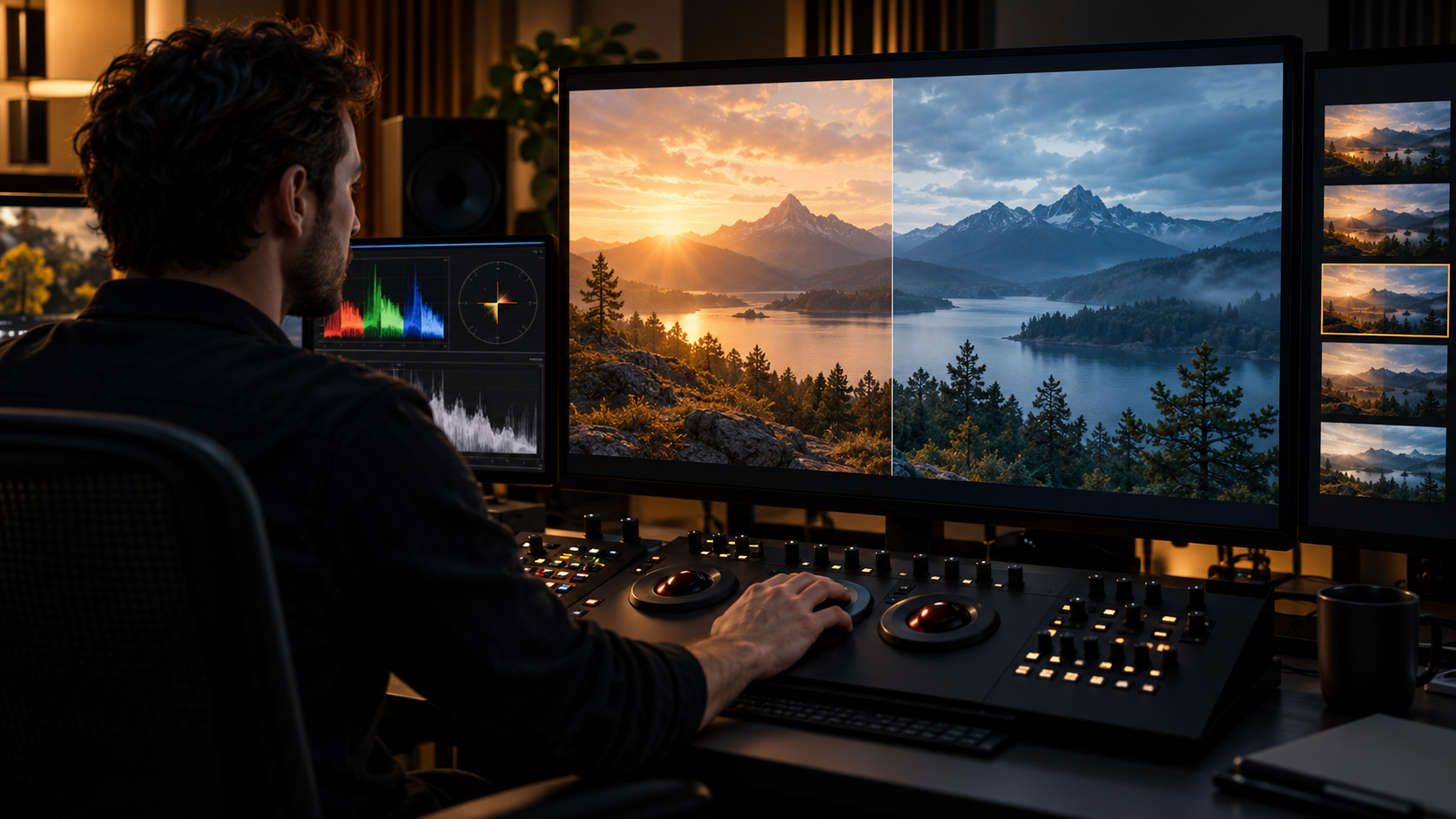
Film Color Grading Explainer
Film color grading is the post-production process of shaping brightness, contrast, hue, saturation, and color relationships across moving images. It helps shots from different cameras, lenses, locations, and times of day belong to one visual world. Grading can be corrective, bringing exposure and white balance into alignment, and expressive, creating a deliberate palette or directing attention within the frame. It is distinct from production design and lighting, but it works with those choices; a grade can refine photographed information, not replace detail that was never captured.
The workflow usually begins with color management, which translates camera originals into a predictable working space and prepares versions for intended displays. Systems such as the Academy Color Encoding System provide a framework for exchanging and preserving color information across cameras, visual effects, grading, and delivery. A colorist then balances individual shots before developing broader looks with the director and cinematographer. Masks, tracked windows, and selective adjustments can guide the eye without changing every part of the image equally.
Continuity is a major part of the craft. Two angles in one conversation may have been photographed minutes or hours apart, yet cuts should not produce distracting jumps in skin tone, sky brightness, or room color. Visual-effects shots must also sit naturally beside photographed footage. The colorist reviews sequences in motion because a still frame can look attractive while a series of cuts feels uneven. Subtle consistency often requires more work than a conspicuous stylized look, precisely because the correction is not meant to announce itself.
Creative grades influence mood and meaning through relationships rather than simple filters. Lower saturation may make one environment feel restrained, while selective warmth can emphasize faces against a cooler background. Contrast can reveal texture or conceal it, and highlights can feel soft, harsh, natural, or unreal. There is no universal palette for an emotion. The same cool image can suggest calm, distance, night, or danger depending on lighting, performance, sound, and the colors surrounding it. Delivery complicates the final result because theatrical projection, television, phones, and high-dynamic-range displays reproduce images differently. Productions create and check separate masters so that the intended hierarchy remains legible across formats. Viewers may also change brightness, contrast, color temperature, or motion settings at home. Color grading therefore combines artistry with measurement: the goal is not one mathematically perfect image, but a controlled visual experience that remains coherent through the production and distribution chain. A practical way to read or discuss Film Color Grading is to separate the basic definition from the choices made in a particular example. Color correction balances technical differences; color grading often includes that work while also developing the finished creative appearance. Then identify who sets the relevant rules, which parts are creative decisions, and which parts follow from law, contracts, technology, or production limits. Examples that look similar on the surface can operate differently because their purpose, audience, timing, and surrounding agreements are different. Secondary adjustments isolate areas by shape, brightness, or color, allowing precise emphasis without applying one treatment to the entire frame. It is also useful to check whether a source is describing a formal industry category, an informal critical label, or one organization's current practice. Those distinctions prevent a memorable anecdote from becoming a false universal rule. The date and market matter too: tools, distribution systems, and standard agreements change, while older examples can preserve assumptions that no longer apply everywhere. When a claim sounds absolute, compare it with a second type of source and look for the conditions under which it is actually true. Finally, compare the visible result with the less visible work that produced it. Separate theatrical, standard-dynamic-range, and high-dynamic-range versions may be checked because display capabilities change how contrast and color are perceived. That approach keeps the explanation grounded while leaving room for reasonable disagreement about borderline cases.
Color correction balances technical differences; color grading often includes that work while also developing the finished creative appearance.
Color management maps camera data through a controlled pipeline so departments and deliverables interpret colors and brightness more consistently.
A colorist evaluates shots as sequences, matching adjacent angles and preserving intentional changes as time, place, or emotion shifts.
Secondary adjustments isolate areas by shape, brightness, or color, allowing precise emphasis without applying one treatment to the entire frame.
A strong look grows from cinematography, design, costume, makeup, visual effects, and grade working together rather than from a preset alone.
Separate theatrical, standard-dynamic-range, and high-dynamic-range versions may be checked because display capabilities change how contrast and color are perceived.
Explore more "Explainers"
Discover additional explainers across politics, science, business, technology, and other fields. Each explainer breaks down a complex idea into clear, everyday language—helping you better understand how major concepts, systems, and debates shape the world around us.